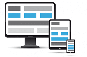
Want to cut down on your workload for website design for phones? Media queries allow desktop content to be altered for smaller screens, so you don’t have to recreate your entire site for mobile!Read More…
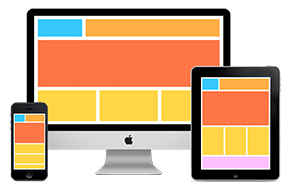
responsive

How to Change Image Resolution for Website Performance
POSTED ON Monday, January 8th, 2018 | Teaching, Tips and Tricks
Want to quickly improve your site’s mobile load time? You can change image resolution based on the user’s screen and device using “picture” or “srcset”.Read More…
A Few Responsive Design Best Practices
Responsive design is the art of making a site look good on every screen. And it’s on every Mr. WPress site. Learn the responsive design best practices from Mr. WPress!Read More…