
Use media queries to quickly design for mobile!
Cut down on workload by altering content instead of replacing it
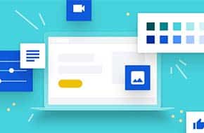
With so much website traffic coming through on mobile devices, designing websites for smaller screens is more important than ever. But how exactly do we go about this? Do we have to recreate the entire content of the website? One version for desktop and one version for mobile? Fortunately not! With media queries, we can alter one version of the content to appear differently based on the user’s screen size. This is a great way to cut down on the workload of website design.
Media Queries and Breakpoints
We’ve talked about media queries before, and while this post will cover more of how they can be used in practice, we’ll cover the basics again briefly. Media queries are part of the CSS language, so they can go in your style.css folder, or in the custom CSS box in your theme customization, or wherever you keep your styling code. The code itself is as follows:
@media only screen and (max-width: 1200px) {

}
Where the max-width is the size of the screen that the styles within the brackets take effect. Any larger screen size, and the CSS code within is ignored. You can also do the same thing in reverse, with “min-width” instead of “max-width,” where the code within will be ignored when the screen size is smaller than the given value.
The values you’ll use for those max-width variables are called “breakpoints,” and they can change depending on the project and personal convictions. But here are a few guidelines (updated from our previous post) to help get you started:
- 1200px (small desktop screens)
- 768px (tablets)
- 480px (phones)
You may find your website design requires more breakpoints, or tweaked values in the media queries, but these are the fundamentals that should get you most of the way through your design process.
Content Sizes
So, now that we know what these media queries are, how do we use them? One of the most crucial but often overlooked elements is the size of your content. And we’re not just talking about images. Font size, line height, and padding and margin are just a few things that may look good on desktop but are suddenly gigantic on a smartphone. There’s no one-size-fits-all template to follow, but you’ll want to adjust these styles so that the content is readable (for font-size, 14px is about the absolute minimum) but still relatively compact. The more content you can fit on the screen, the less distance users will have to scroll. The less distance they scroll, the more of your content they’ll actually see.
Layout
Another important element of web design to keep in mind is the layout of your pages. This is especially important if you’re using column layouts, with or without tools such as column shortcodes. If you aren’t, then you may want to put the column styling within some min-width media queries – using columns on mobile can easily cause the content to look mashed together, or else too squeezed and small to be readable. If you are using a plugin or other tool, then pay attention to how your content will stack on mobile. If you have an image to the left of some copy, but the copy is the most important element, you’ll likely want it to be above the image on mobile. It may take some additional styling to get the content to stack in the order you want.
Miscellaneous design elements to keep in mind
- Check your content width! If you set a max-width of your content at 1200px for example, the content on smaller screen sizes may touch the edges and hinder readability. Either provide some side padding within media queries, or set your width using percentages
- If you want a section to take up a certain percentage of the screen, use the handy relative units of vh (view height) and vw (view width) to ensure the size carries over to different screen dimensions
- Videos will not autoplay on mobile, and video backgrounds just won’t work. It’s best practice to provide a background image to fall back on.
Good luck with your responsive website design! If you need any assistance with this, please don’t hesistate to reach out to Mr. WPress and request a free quote to see how we can assist.