
Use the “position” attribute to position elements!
Get precise with your page layouts
We’ve talked before about how different elements on your website pages can be displayed with the CSS attribute of the same name. But that doesn’t usually affect where the item appears on the page. Sometimes you can get to your desired layout using simple padding and margin, but other times you need to make a more specific adjustment. That’s where the CSS attribute position, as well as its directional counterparts (top, bottom, left, right) come into play. After giving an element a type of position attribute, you can use the directional attributes to move an item from that position by the typical measurements (pixels, percentages, em). This is super powerful for bringing a very particular design to life on the page, allowing you to adjust positioning down to the pixel when needed!
Note: For the directional attributes, note that a declaration like “top: 5px;” would move the element five pixels from the top boundary. But you can also use negative values, like “top: -5px;” if positioning from the bottom boundary doesn’t make sense.
The default position: static
The default for the position attribute is “static,” and like other defaults, it doesn’t require you to actually declare it to make it so. You only need to specify the position attribute if you want something other than static, or if you’re overwriting somebody else’s code that set it to something other than static. The static value doesn’t do anything special, it just specifies that the element should be positioned as it normally would in the flow of the page. In fact, it even supersedes the directional attributes (again: top, bottom, left, right). They won’t have any effect.
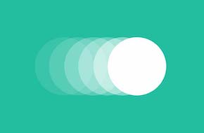
Stick elements with position: fixed (or position: sticky)
The “fixed” value for position means than the element will be positioned relative to the viewport, or browser window. An element with a fixed position will always be on screen, and always in the same relative location, no matter how the user scrolls. This position value also essentially takes the element out of the normal flow of the page. No gap or blank space will be left where the item “should” have been in the code, it’s completely removed in order to be a new, fixed attribute on the page. This is most commonly used for sticky menu bars or little support icons in the bottom corners of website pages, but there are some fringe cases where this may be used too!
The newest possible value for the position attribute is “sticky,” which switches between the “relative” value and the fixed value depending on the user’s scroll position. An element with position: sticky will appear in its normal spot further down the page, but when a user reaches it, will “stick” (or switch to be position fixed) from that point down on the page. As this is a newer take on the attribute, Internet Explorer does not support this value (and Safari requires a different, special declaration with a -webkit- prefix).
Tweak the layout with position: relative
As the name implies, the “relative” value positions an element relative to its normal position. Declaring position: relative along with directional attributes will adjust the element’s normal position, allowing you to make tweaks ranging in size from a few pixels to a large percentage of the page. Though do note that the surrounding content won’t adjust to fill any gaps left behind. That initial “slot” for the element is still there, and setting this CSS just adjusts it relative to that slot.
Please note (again) as well that the directional declarations move an element away from the specified boundary. For example, “top: 5px;” would move the element five pixels away from the top edge of its default, static position.
Make big moves with position: absolute
The “absolute” value is the trickiest of the bunch. It positions an element relative to the nearest parent or ancestor element that also has a position value besides static. If no parent element has any positioning, it uses the document’s body element, which in turn means it acts like it has the “fixed” value for its position. Like “fixed” as well, the absolute value also takes the element out of its normal position on the page. No blank space or “slot” will be left behind like with the “relative” value, but this also means an element with the absolute value can overlap with other elements, which is an important consideration when styling the page. Another CSS attribute you’ll likely be using with an absolute position is the “z-index”, which sets an element’s priority in appearing on top of other elements. The higher the z-index value, the more priority that element is given.
Need help bringing your website page from design file to reality? Don’t hesitate to reach out to us today for a free quote!