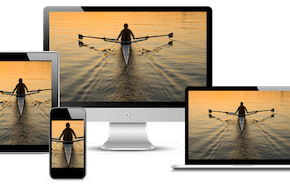
Give Your Users the Ideal Experience!
Switch Up Your Content Without Tanking Your Load Speed
When designing a page, you’ll come across a scenario sometimes where one asset won’t work across both desktop and mobile. Maybe there are too many fine details in a large image that get lost on mobile, or maybe a video’s dimensions are too tall to display well on desktop. Don’t worry – there are ways to resolve this issue! You can target that troublesome media and make it pull from a different source depending on the device being used. There are several options here, but some go against responsive design best practices, so be sure to choose carefully.
Don’t just hide the offender with CSS
One of the easiest, and unfortunately most common, methods is to simply hide the offending media on screens where it doesn’t work. A common variation on this is duplicating the video or image, changing the source, and then using CSS to hide one on desktop and hide the other on mobile. However, even though the media may not show up on the screen, it’s still built into the HTML. That means it’s loading in the background, and likely making your page speed take a hit. While bad enough for hiding one variation that doesn’t work, it’s doubly bad when going with the duplication method. You’re loading two images or videos instead of just one, which slows down your load time all the more. In short, don’t hide your media with CSS! There are much more effective ways to accomplish what you’re going for.
Add in the proper media source when you need it
The crux of this method is that you load a minimal placeholder image, until you need the proper one.
- When designing your page, put in the image as you normally would.
- Create a ‘placeholder’ image of the same dimensions (so it takes up the same space on the page) and sub out the normal image source. A JPG of a solid color works best, since it has minimal data and small file size.
- Using CSS and media queries, set the image to hide on the screen sizes you don’t want it to show. Now, instead of loading the full-fledged bulky image, you’re only loading a few KB which won’t hurt your speeds.
- At the bottom of your page, add a jQuery script that changes the image source depending on window width. Now, your image will load in on the devices you want, and truly be gone on the devices you don’t.
Here’s a basic example:
if ($(window).width() < 980) {
     $("img#yourImage").attr('src' , newURL);
}
This same principle works for videos, too. Just set up your video to only have a small poster image, and then append the actual video source only on the screen sizes you need. We’ll show an example of this is the next section.
Switch your source with jQuery
Taking the last option a step further is ideal for when you have two different assets you want to switch between on desktop and mobile. You can use jQuery not only to add the right source when needed, but switch between sources depending on screen size. This makes it so that your page is only actually loading one of the big assets, which is a major boon for your load times.
We’ll cover an example with a video this time. It’s a little more complicated, since you’ll want to set the sources as variables in order to clean up the code in the actual function. Here’s how you set up your video to default to a poster image:
<video id="yourVideo">
     <img src="placeholderImageURL" />
</video>
Then, you can target this video to append the appropriate video source:
var mainVideo = $('video#yourVideo');
var mobileSrc = "mobileVideoURL";
var desktopSrc = "desktopVideoURL";

if ($(window).width() < 980) {
     mainVideo.append("<source type='video/mp4' src='" + mobileSrc + "' />");
} else {
     mainVideo.append("<source type='video/mp4' src='" + desktopSrc + "' />");
}
This same principle applies to images too, though you’d want to copy the function format from the previous section instead of appending the source like with a video.
Set Different Image Resolutions with Srcset
Maybe you don’t want to serve entirely different images between devices, but you just want to scale the resolution up or down depending on what the device is capable of. That’s certainly another option in your responsive design! The image element in HTML has capabilities built right in for this. You can use the ‘srcset’ attribute with a few different criteria to change resolutions quickly and easily. There’s even the option to serve different image sizes with the ‘sizes’ attribute. Using this technique is a little more complicated, but you can find in-depth documentation and examples on the Mozilla website.
Need some help serving up optimized images, or tackling responsive design in general? At Mr. WPress, we have years of experience creating tailored websites for devices of all shapes and sizes. More than that, we’re committed to creating lightweight and fast-loading websites to deliver those sites fast! Reach out to us for a free quote to see how we can help you streamline and optimize your website.


