3 Tips for Designing a Converting Landing Page
Make your page architecture work for you
We’ve talked before about landing pages, in regards to Google Ads in particular. But that’s not the only place good landing page practices apply. Maybe you have a page that’s getting great organic traffic, or maybe you’re running ads on Facebook or LinkedIn. Maybe you’ve got a page you backlink to, or maybe you just want to send users to a page to sell them in your own menu. The entire point of a landing page is to get your users to take an action – sometimes that’s to sell something, or it could be to take a free trial or provide their email address.
A Quick Summary
We don’t want to cover the exact same information we’ve talked about before in our Google Ads post. We’d recommend reading the whole thing, but it is a pretty long post. If you’re light on time, here’s a quick summary for your reference:
- Have a clear call to action, and limit your user’s options as much as possible. You don’t want to create an environment for decision paralysis, where offering too many options results in the user choosing nothing.
- Write copy about your benefits to convince your users to convert. Don’t just assume they know what they’re getting into, but provide clear information for them.
- Support your copy with compelling visual elements. These add value to the page, and engage your users in more than one sense.
- Use reviews, testimonials, guarantees, and/or open communication to validate your offering. These aren’t required, but they help give your site a sense of credibility.
- Test! Implement AB tests to ensure that you’re providing the best possible experience. Don’t just set it and forget it!
An Ongoing Process
Now that we have a high-level overview, we’ll go into some more practical examples, and even look at effective landing pages. But keep in mind that this is an ongoing process. Web design trends change with user’s tastes, and the work of an advertiser is never done. It’s important to note that you should take what applies best to your landing pages, and not stress too much about matching the examples exactly, since trends will change sooner than you think. We’ll try to look deeper at the underlying reasons for these design choices, which will carry over no matter what’s in or out.
Make Your Offer Bold and Clear
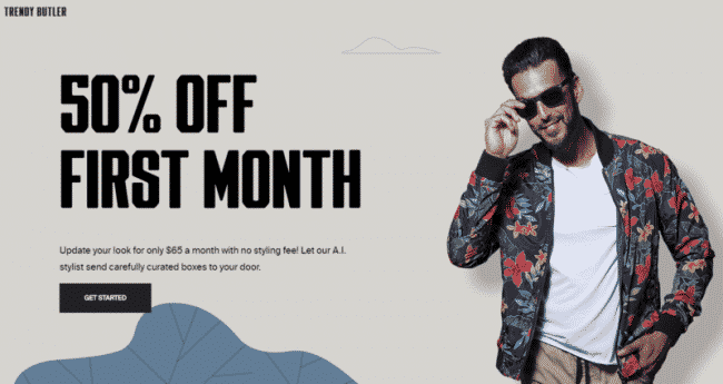
Check out the example below – and notice how clear the offer is. As soon as the user hits the page, they know exactly what value they’re getting (50% off the first month). A little further reading of the subtext makes it clear what service is being offered, and then that’s it. There’s no clutter on the page, in fact, you could count the number of main elements on one hand. This allows the user to focus on one thing in particular, and decide if they’re interested before being bogged down with information that may or may not be relevant. Scrolling further down the page will reveal more information like testimonials and product benefits, but it’s up to the user to take an action to get there, which they won’t do if they’re not interested in the base premise.
Even further down the page though, it’s worthwhile to give each key message its own panel. Just like the offer in the first panel, if you want to include some third party validation, give it an entire section to itself. This allows you to get your message across with crystal clarity, and ensures information doesn’t get lost among a mix of other important information. In short, fine-tune your landing page to provide clear information to the customer. The less confusion they feel, the more confidence they’ll have in making a purchase decision.
Drive Users Down the Page with Design Elements
The above example had some of this too, but the example below really explores the space with geometric shapes. At first bluff, the purpose may not be directly clear. But look at the page a couple of times, and pay attention to where your eye goes. The curved lines and color contrast naturally draw your eye down the page, keeping a steady flow that ensures you don’t get bogged down on a single piece of information. Without this flow, the user may only ever read one benefit instead of three, or never see the testimonials that boost their confidence over the edge.
Whether you do it with geometric shapes, enticing copy, or a big button that directly says “Learn More,” it’s key to drive your users as far down the page as you can. The farther down the page they get, the more information they receive. And as long as the overarching call to action is clear, more information can only help lead to a purchase.
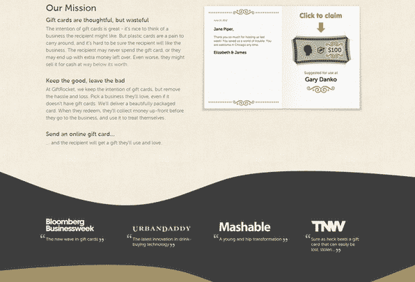
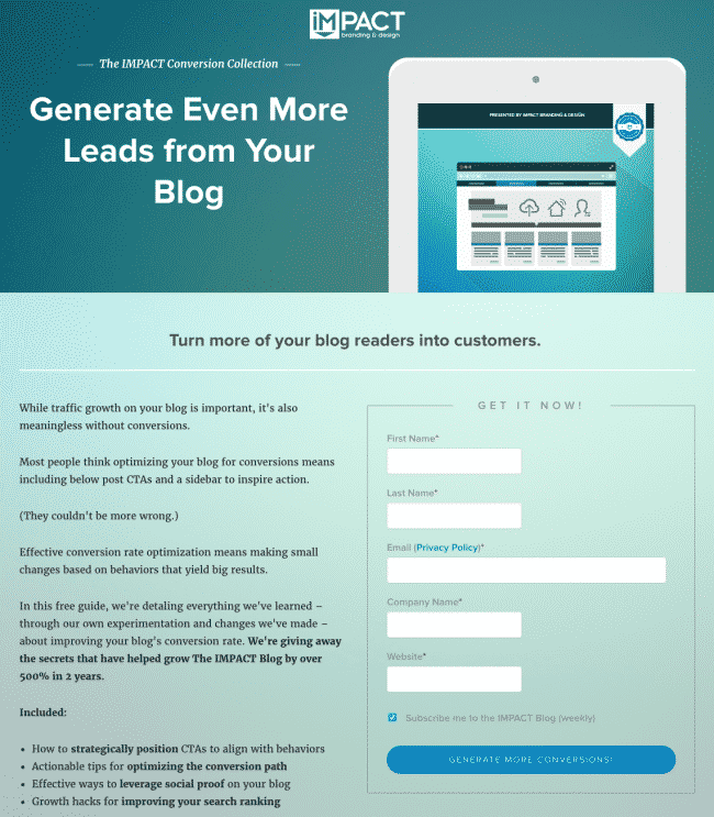
Don’t Be Afraid to Include Lots of Copy
Not too long ago, it was almost seen as gauche to have long paragraphs of text on your page. It was an outdated trend, before we had the ability to load up big, beautiful images in the blink of an eye. But as proof of the changing views, just take a look at the above example, and especially the one below. Copy is on the way back in. In essence, those who are going to bounce are going to bounce anyway, so why not provide those who are interested with truly detailed and comprehensive information? Like the point above, more information to an interested party never hurts.
Note that the copy isn’t just center-aligned on a plain white page, though, too. A muted background gradient and tactful paragraph breaks make the text easy on the eyes, enticing interested users to read more about what they’re signing up for. All of this serves to provide people who land on the page with as much information as possible, without putting unnecessary wear on their eyes. In short, trust your users! Don’t try to trick them into purchasing something they don’t know all the details about, but allow them to make an informed decision with the lowest chance of buyer’s remorse.
Need some help designing an effective landing page? We’d be delighted to help! Don’t hesitate to reach out to us at Mr. WPress for a free quote to see how we can help you create a converting landing page.